Acquiring new customers is costly and sometimes ineffective
It is unfortunate that many of our users were unaware of the referral program offered by Zenyum, as we had not placed enough emphasis on it. Through this experience, we have realized the importance of expanding our referral programs as acquiring new customers can be costly and time-consuming.
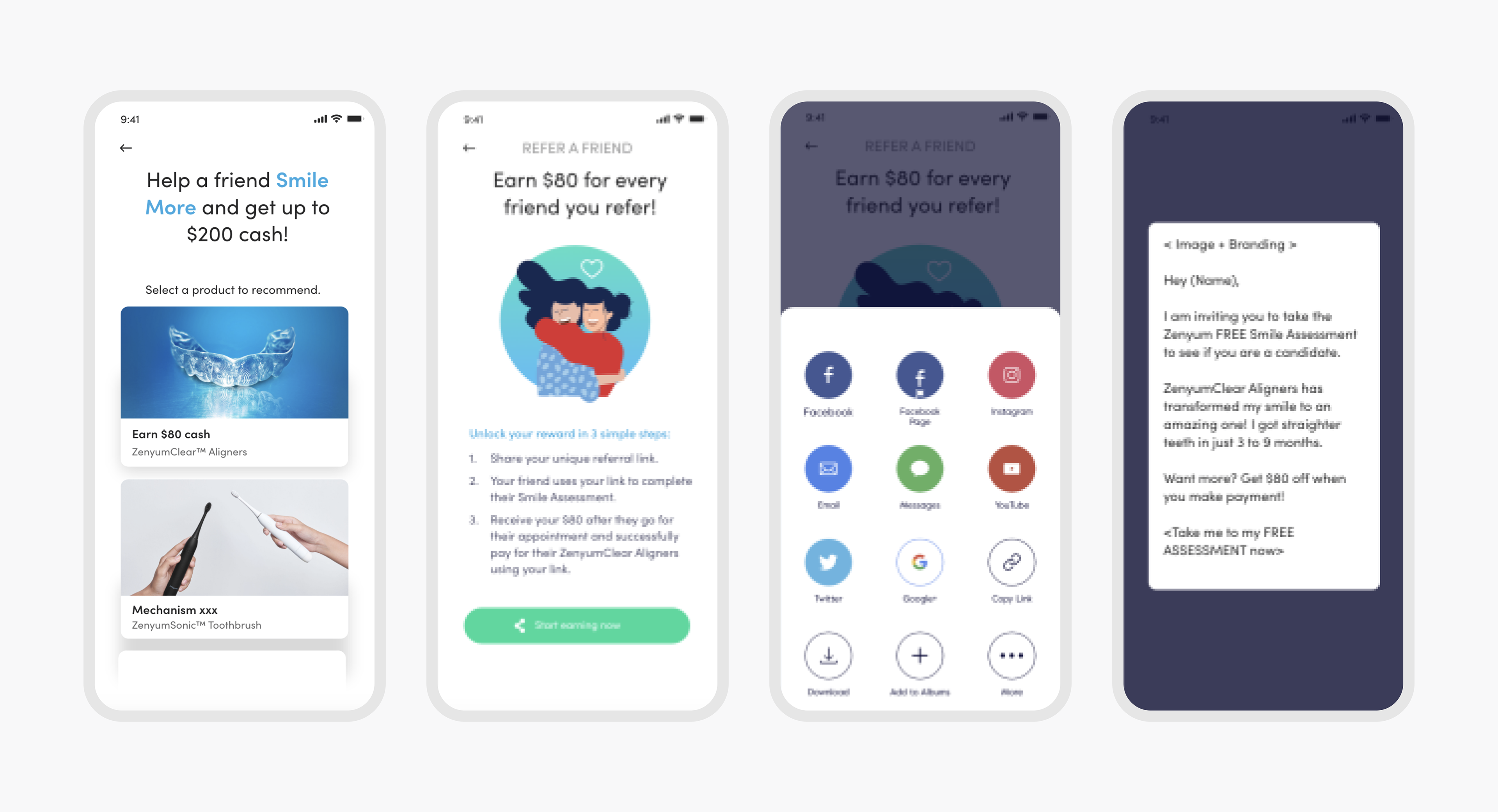
Old refer a friend screens
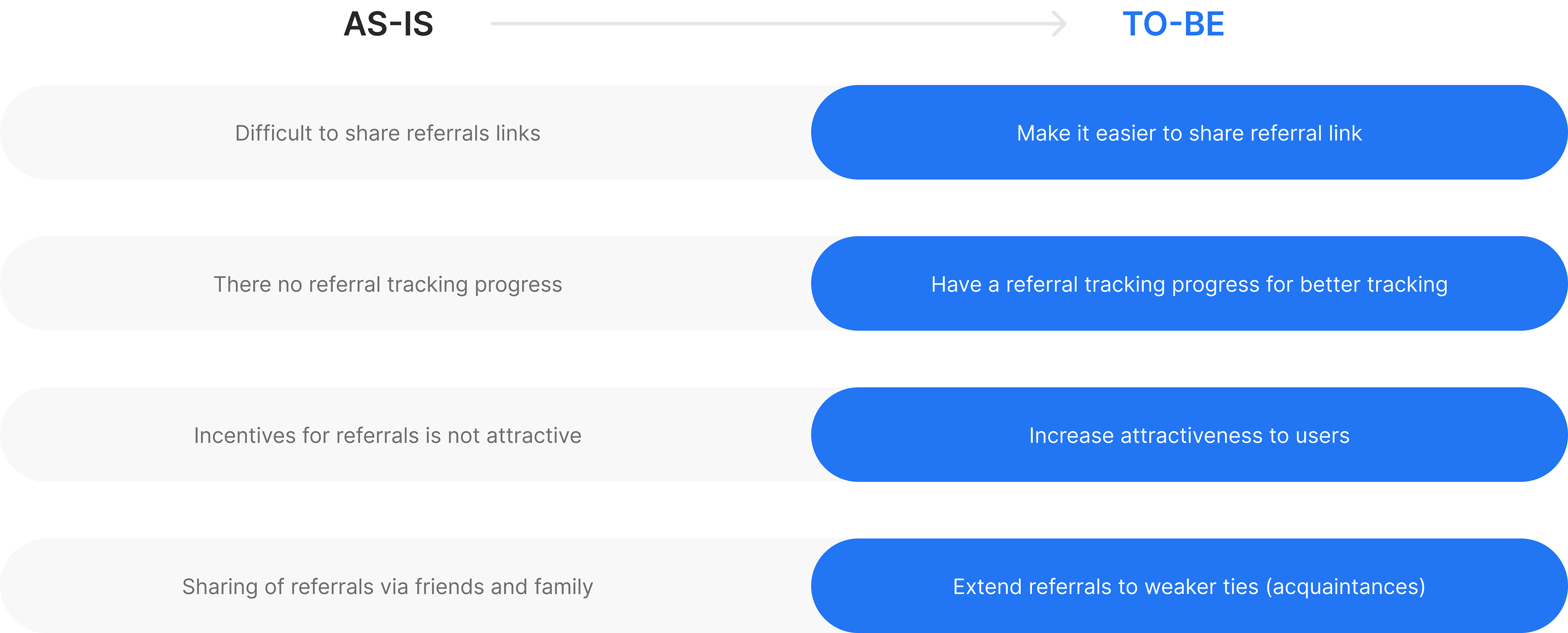
The challenge
The program needs to be simple for users to understand and participate in, with clear incentives for referring friends and easy tracking for both the referrer and the referred. Additionally, the program should be integrated seamlessly into our app and website, making it easily accessible for all users.
Design solution
Creating a user-friendly program that is easy to share with friends and family. To make the program more attractive and visible.
Outcomes

Understanding the markets
Zenyum’s referral program uses a common link sharing system but lacks a simple referral tracking compared to other companies. The success of a referral program depends on two factor:
1. Metaperception - desire to recommend credible products by family or friends
2. Reward per referral attractiveness - appealing reward encourages referrals
2. Reward per referral attractiveness - appealing reward encourages referrals
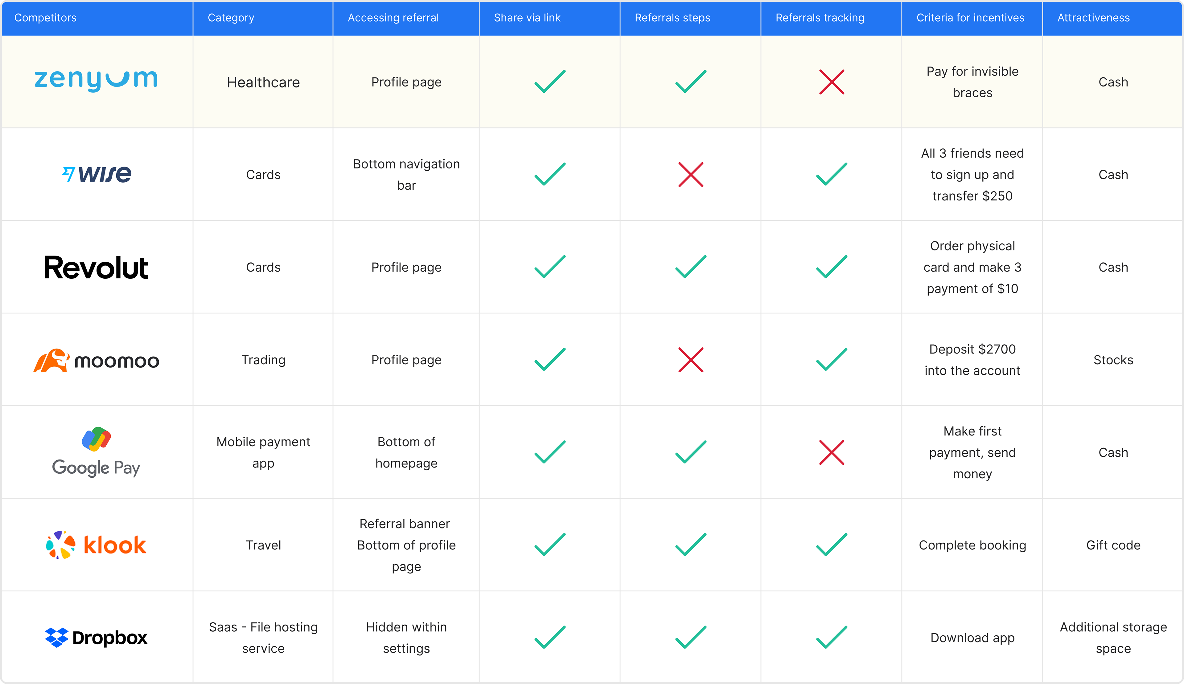
Competitor analysis was done on 6 companies
Pushing our limits of referrals
After gathering insights from studying other competitors’ referral programs, we will need to explore other options to increase visibility, shareability, and attractiveness.
Many designs refinements and tweaks
Our first hypothesis was that the entry points to the referral screens were not visible because it takes 6 clicks for a user to share their referral links from the homepage. Our goal was to increase the visibility and share-ability of the referral screen.
The first attempt
Reduced clicks in aligner referral program led to a 38% increase in referrals. Simple design helped but share and copy links have low click rate. Need to increase attractiveness and shareability to improve conversion rate.

Back to the drawing board
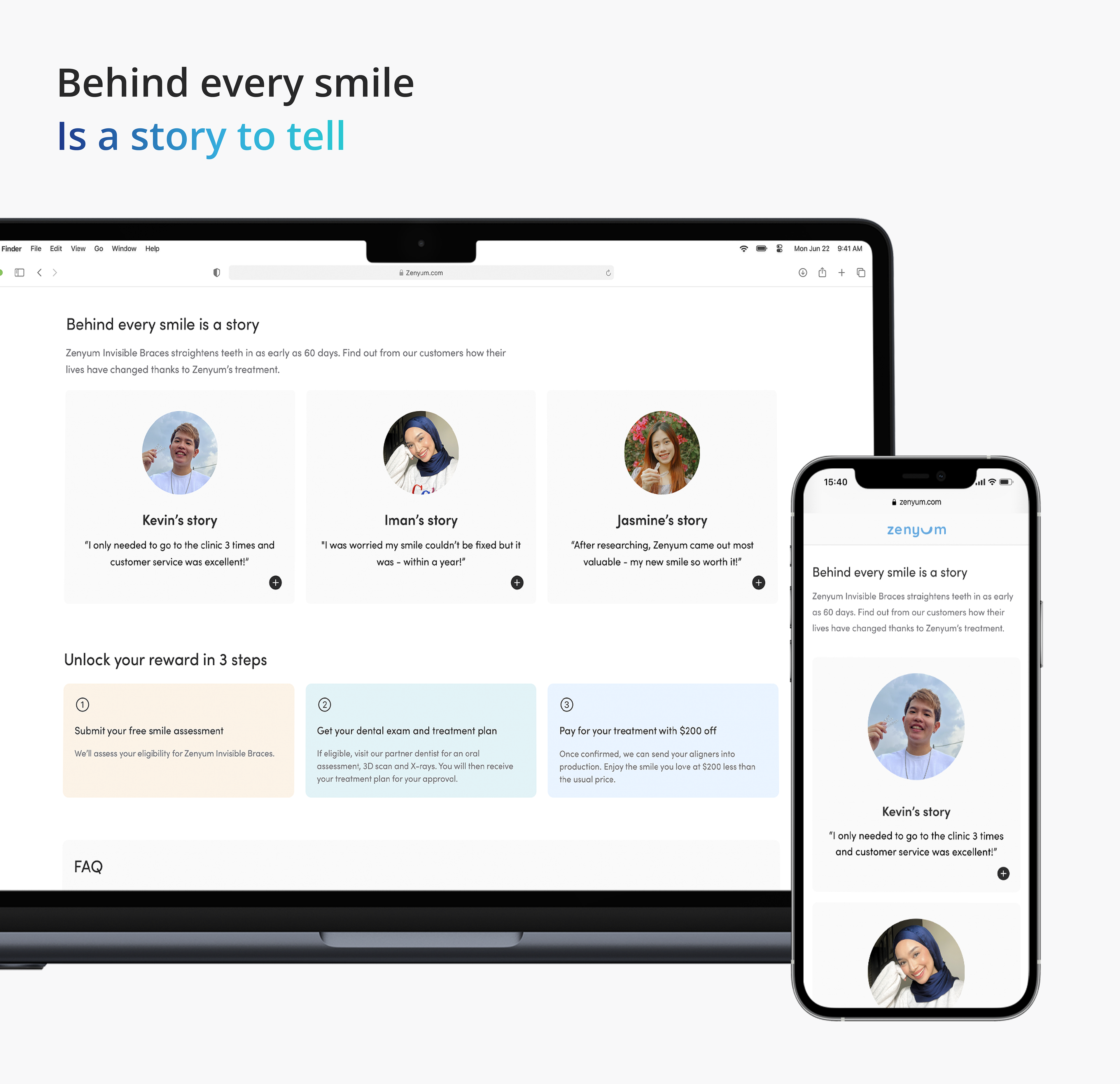
Redesigned recipient's landing page but only saw 1 in 10 monthly clicks. Using an image of smiling people added personal touch but didn't improve conversion rate. Feedback from product managers suggests users aren't attracted to the page.
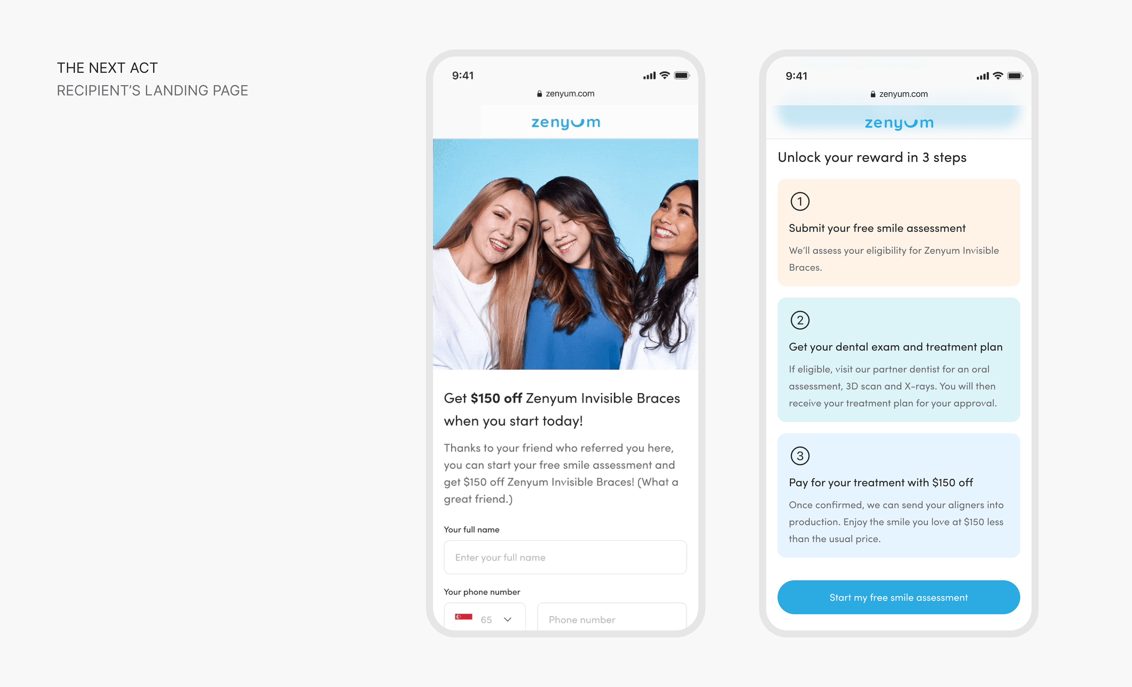
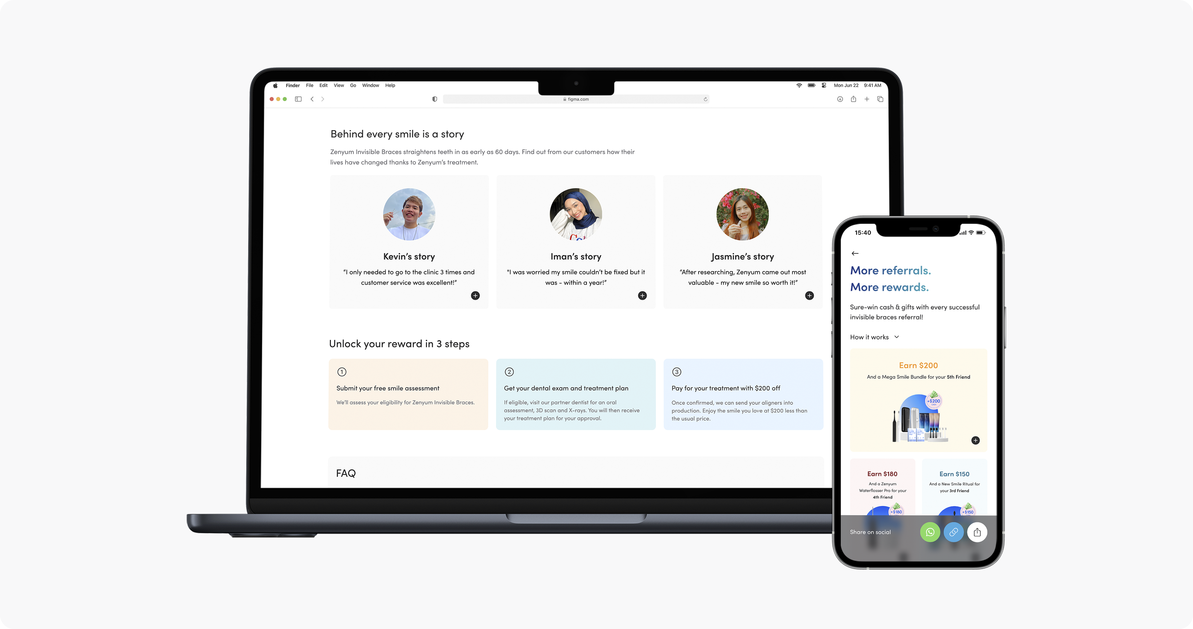
Improved recipient’s landing page
Back to getting inspired by different competitor apps and asking ourselves; how can we make the page more attractive and inspiring for the user to continue their journey with us? How might we capture the user’s attention and motivate them to fill up the referral form? We tweaked the design by removing the image and added a personalized message to the recipient to draw the user’s attention toward what we have to offer.

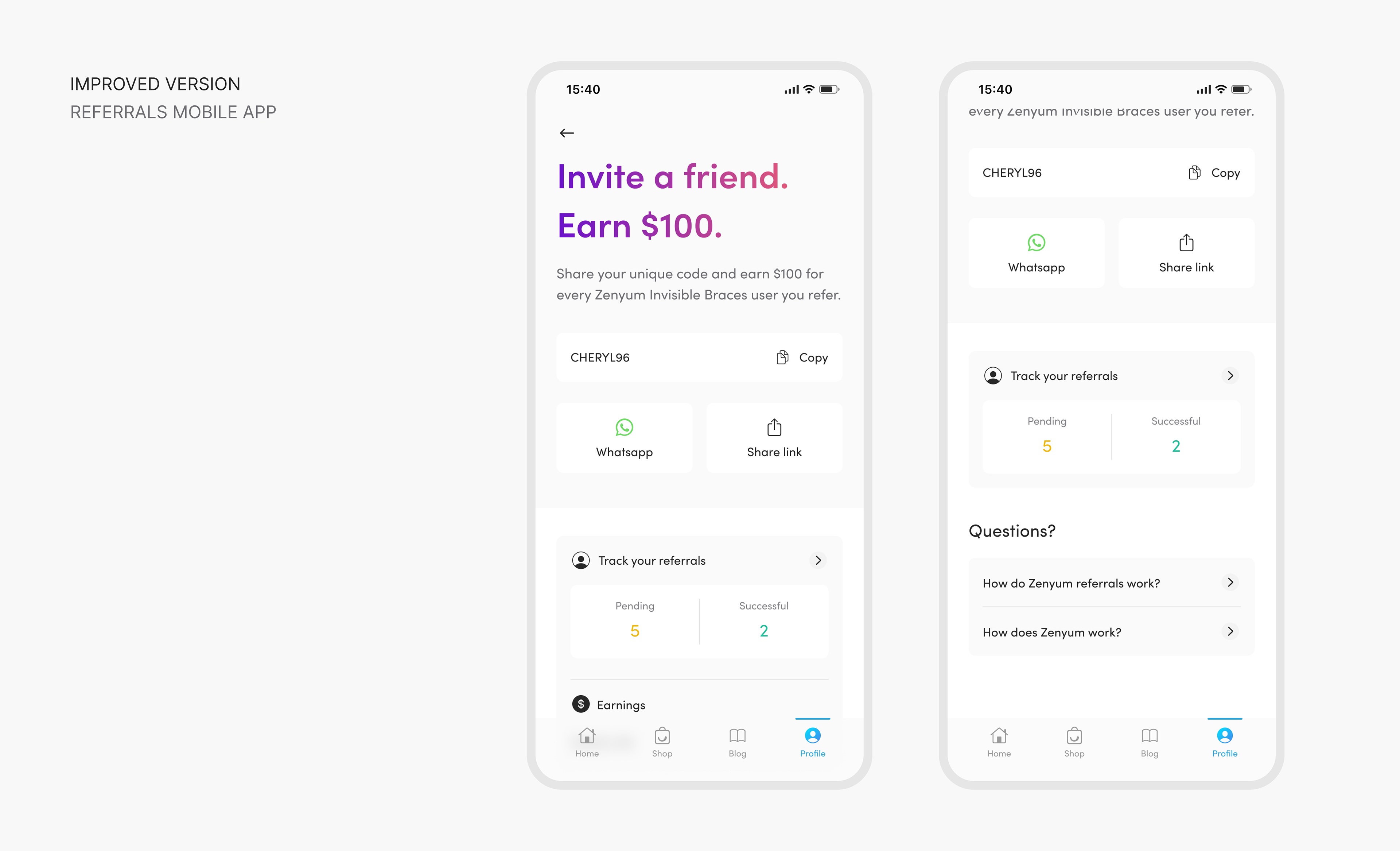
2nd act: Improved the referral app screen
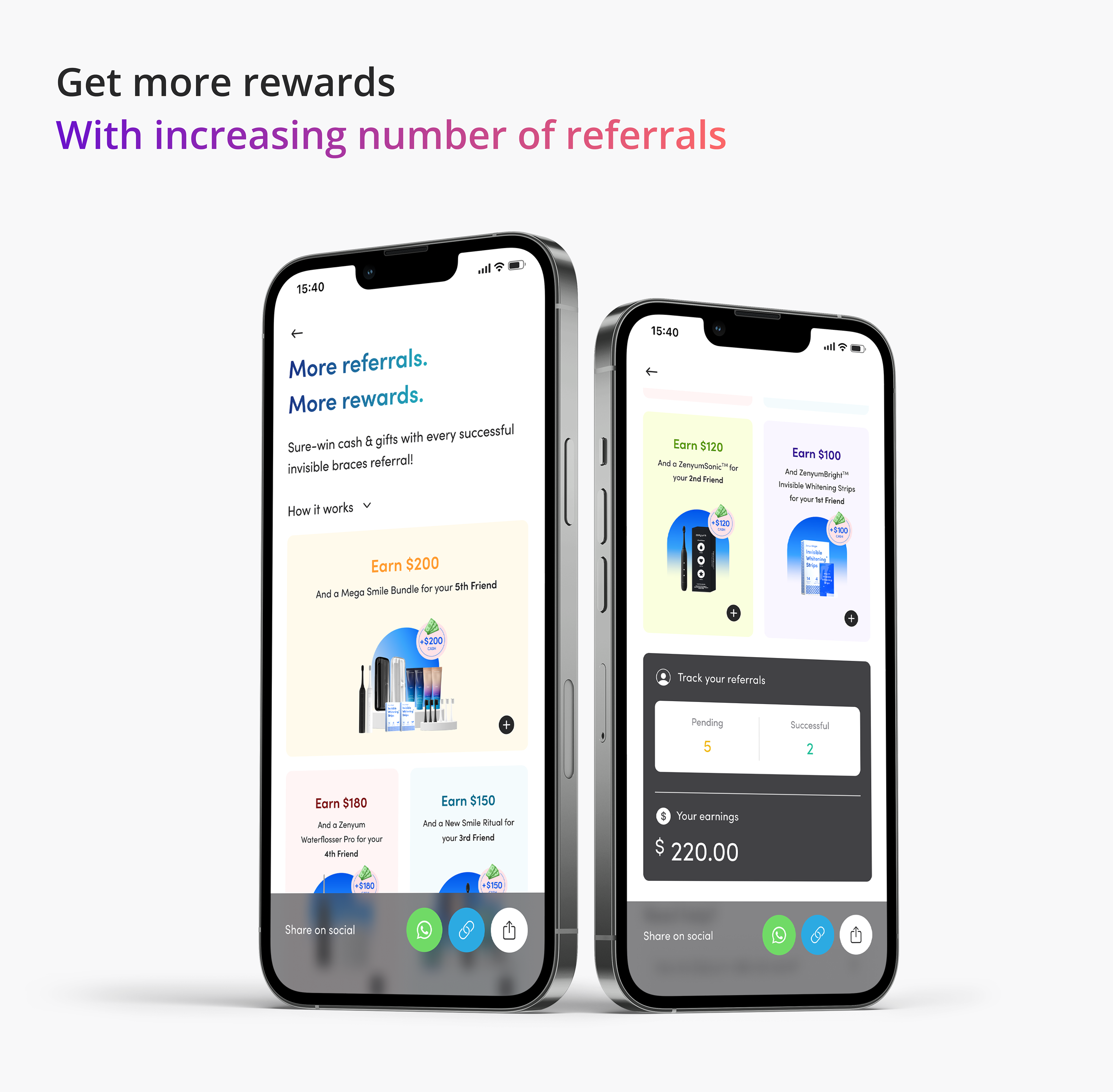
To improve referral app, Zenyum needs a tracker due to longer progress and lack of control over case acceptance, consultation, and treatment planning. Tracker will encourage referrers to prompt actions. Showing number of referred users and earned amount is crucial, as people tend to refer closer ties, so displaying number of referred users and earned amount is important.
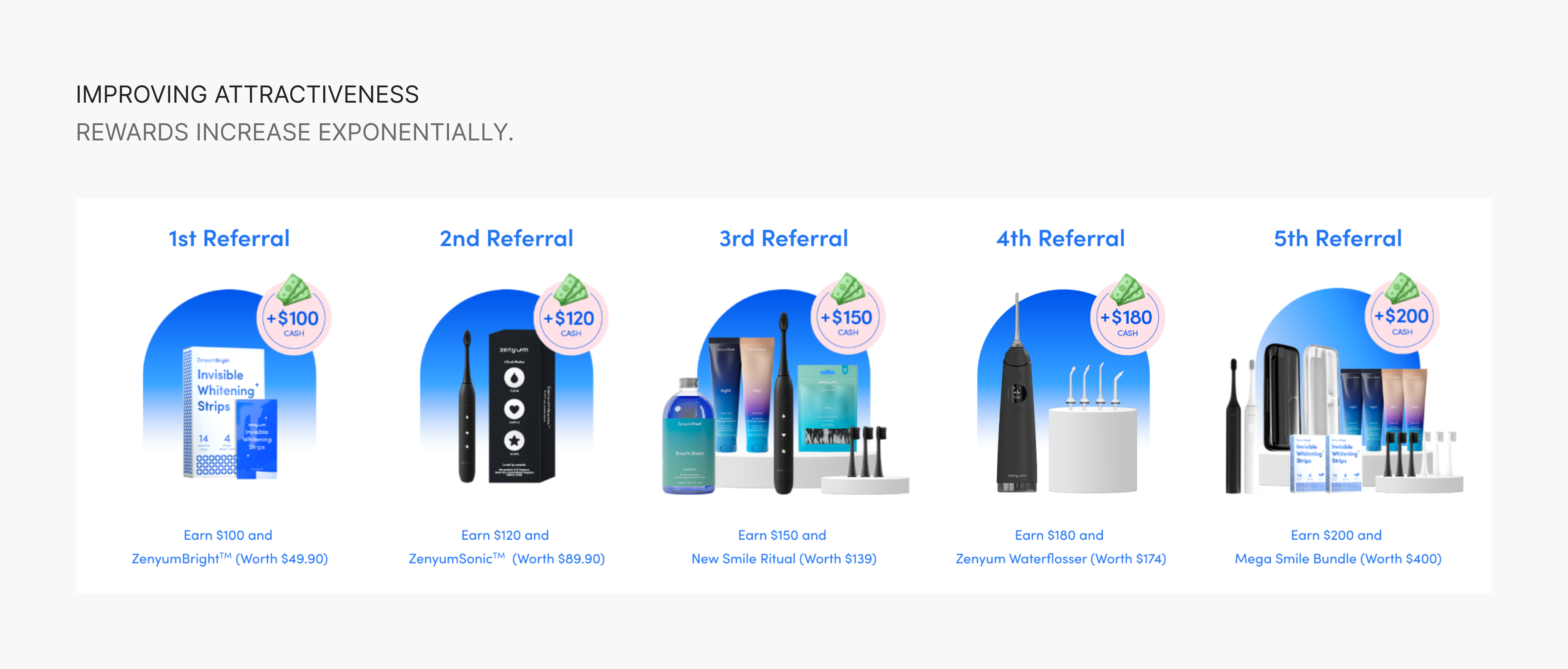
Improved attractiveness
Improved referral program by making reward more attractive. Research shows more users will refer if reward is appealing and they will put in effort to share with distant friends. More successful referrals lead to better rewards and gifts.
The last act
Final design
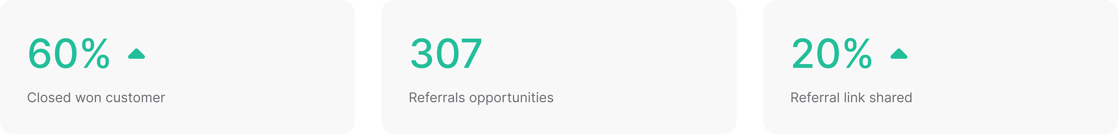
The outcomes
After a few months since launch, we have seen a total of 307 referral opportunities per month and a 20% increase in referral link share since August. We saw a total of 60% increase in referral conversion for closed-won customers in Singapore.