Patients are not using the existing aligners timer to track their
wear-time accurately.
Our users have been manually tracking how long they have worn their aligners instead of using the app to keep track. This is a problem because the users find it difficult to track their timing and there is no flexibility in editing wear-time which could lead to inaccuracy of wear-time hours. This could potentially delay their treatment and affect the expected outcomes.
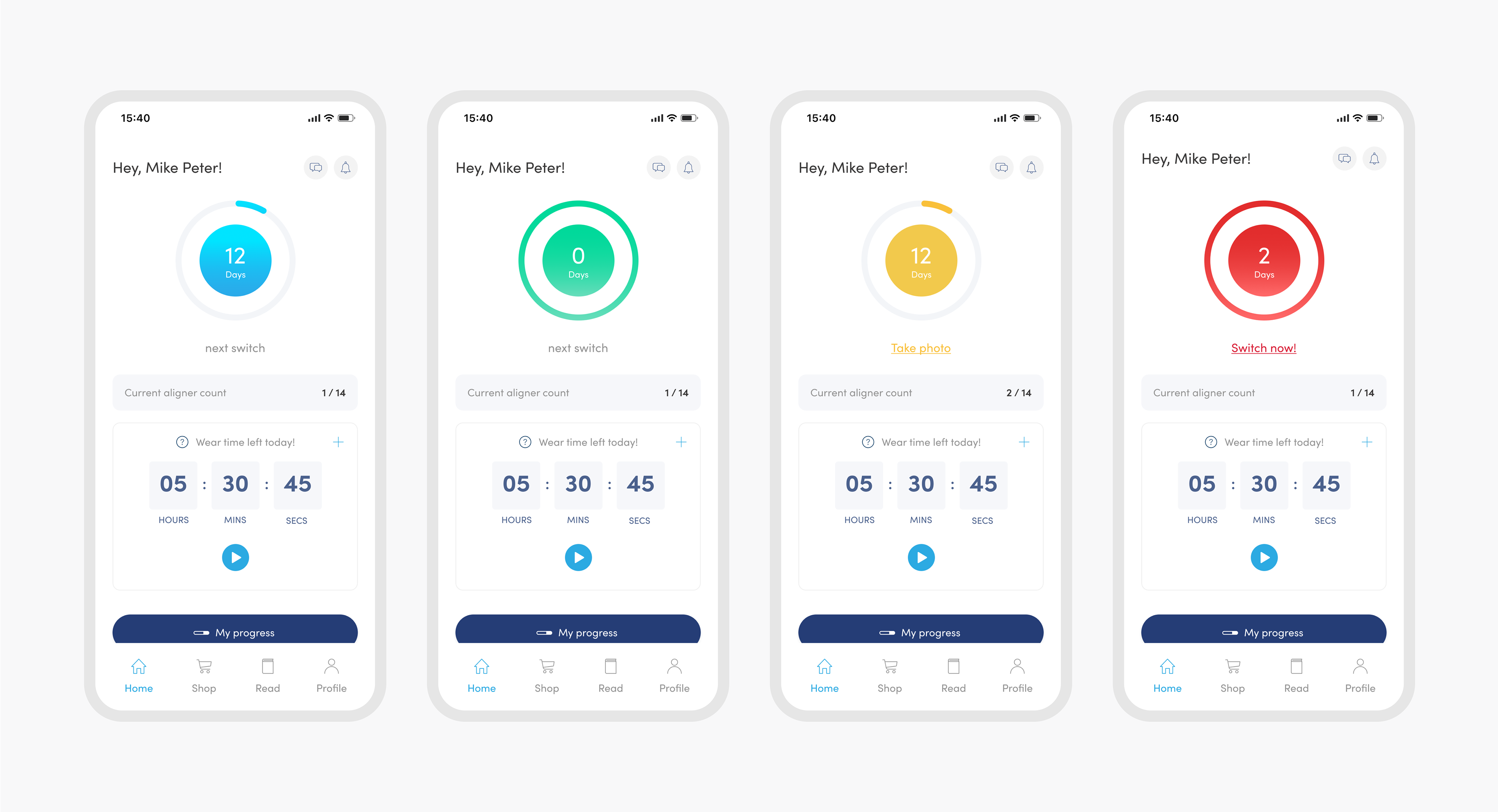
Old treatment monitoring dashboard design
The challenge
With a tight deadline of 3 months to meet, I had to work quickly to get the final design ready to hand off to our developers. Also, it was challenging to design something that would encourage users to intuitively and accurately track their wear-time and switch aligners hence ensuring that they adhere to the treatment.
The design solution
Enhance user experience by adding flexibility in adjusting wear time and implementing effortless tracking and real-time monitoring. This provides users with the precision and ease they require to achieve their desired smile results.
How did it perform?
Research
Picking up the pieces
Cherelle our UX researcher conducted a survey on 590 existing app users to track their usage and gauge the effectiveness of the existing tracker and identify areas for improvement.
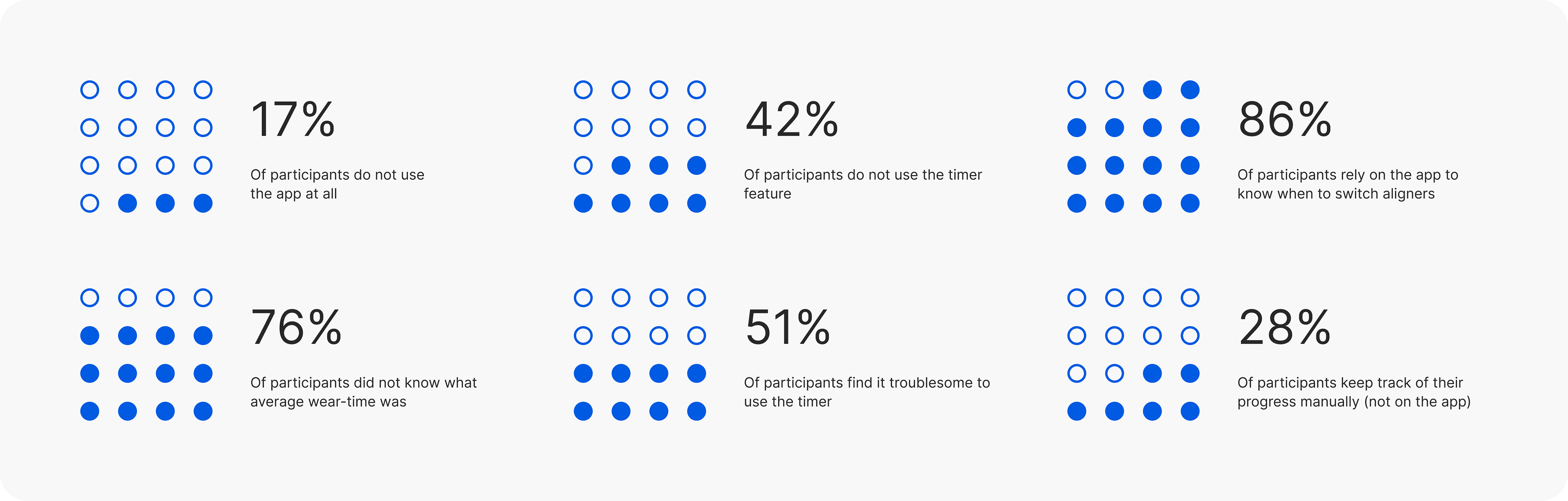
Survey results
User interviews
A series of in-depth interviews were then conducted with 5 participants to further identify pain points, frustrations, needs, and desires with existing products to determine how we could improve their experience.
Insights and takeaways
We extracted insights from our user surveys and in-depth interviews. Our goal was to understand the challenges aligner patients faced when using the Zenyum app.
Redefine goals
Our high-level goals:
1. Design a simple to use and intuitive interface for user to keep track of their aligners progress.
2. To improve user adherence to their treatment progress and ensure that they wear their aligners and switching their aligners on time.
3. A personalised tracking features to help users visualize their progress and stay engaged with the app.
4. Improved user satisfaction through innovation and better user experience.
Initial design
After conducting research, I proceeded to create wireframes and user flows in order to conceptualize the app's functionality and user interactions. I focused on creating a clean and intuitive interface that would allow users to quickly and easily input and view their aligner wear time hours from the start of onboarding.
Design iterations - design language
I started to develop a design language as we worked on the wireframes. The design library and visual direction were influenced by the new brand direction. I want it to be simple, vibrant and clean.

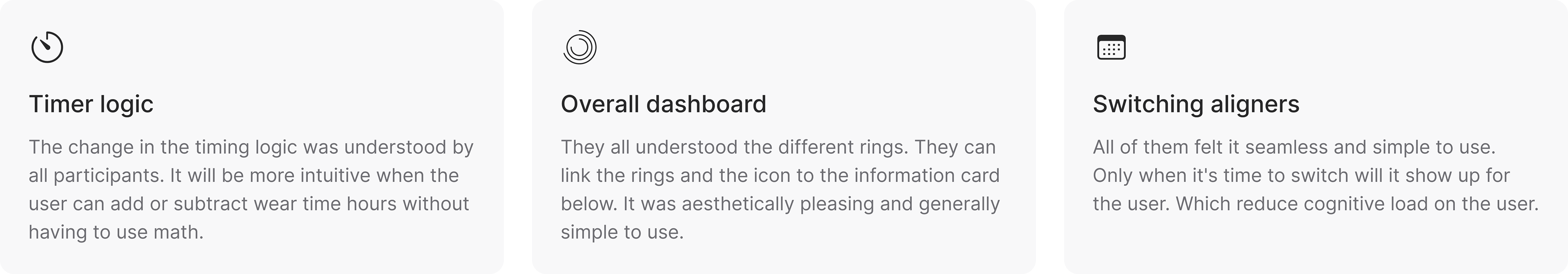
Usability test
Prototyping was the most effective way to gain meaningful feedback from our users. We went through 3 rounds of user interviews and tested our assumptions. Here are the insights:
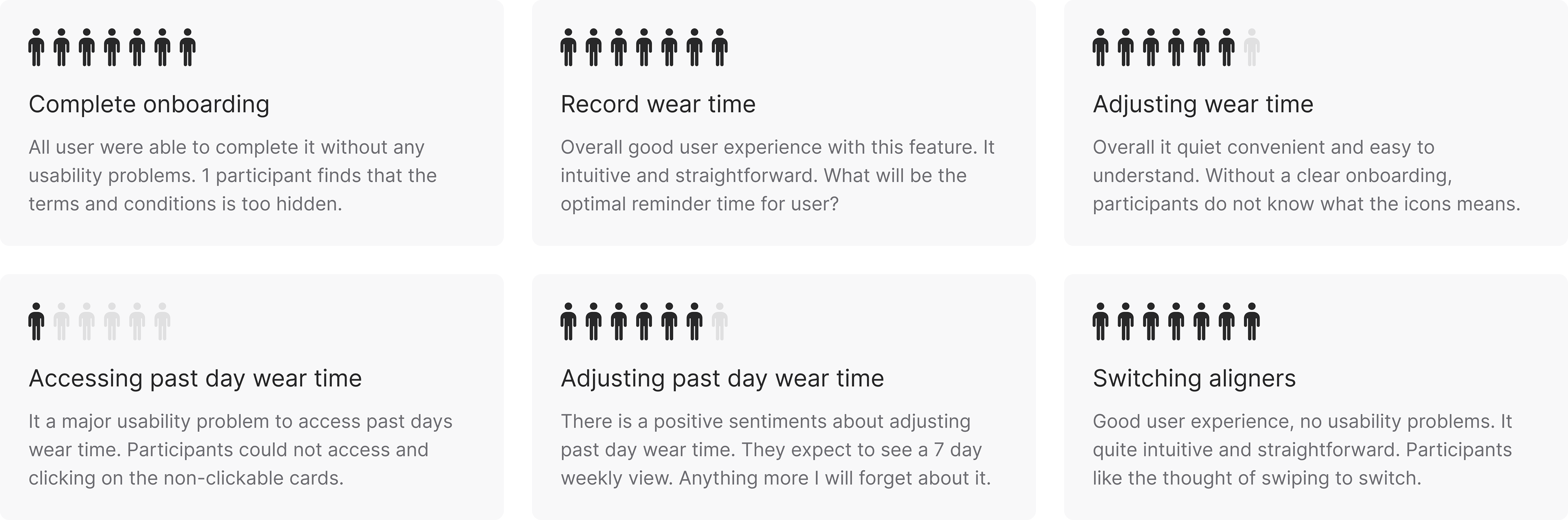
Research outcomes
I have synthesis and analyse on user insights and gain meaningful feedback from the users. We did a total of 2 moderated and 1 unmoderated user testing. And here are the 3 main key research outcomes.
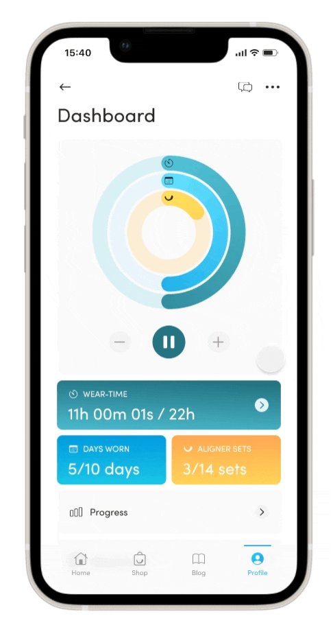
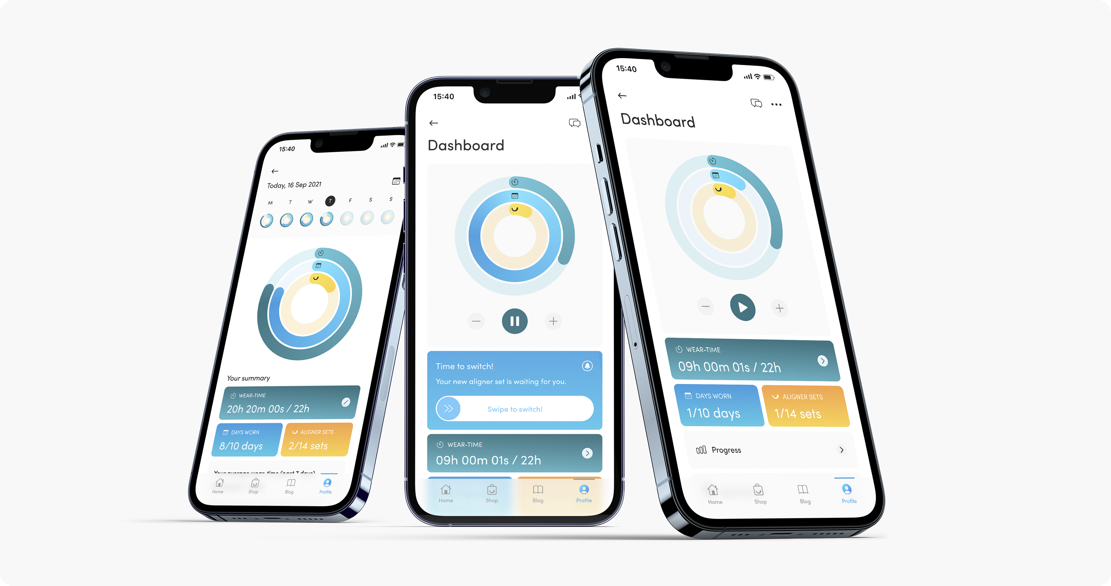
Aligner monitoring
Made simple.
Made simple.
Intuitive. Effortless.
Swipe to Switch.
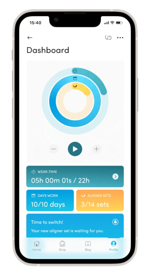
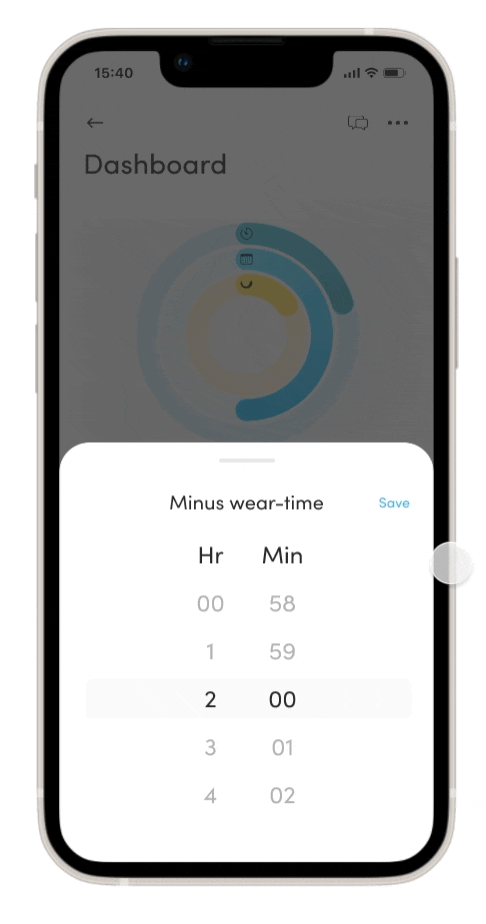
Add. Minus. Edit.
Anywhere, anytime.
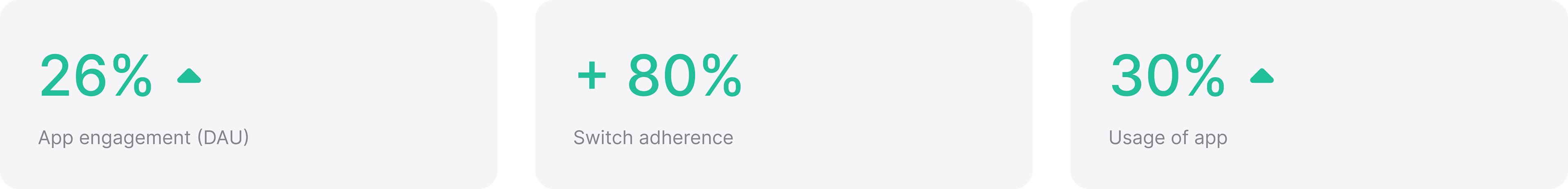
The outcome
Since then, we have seen an increase of 26% in in-app engagement (DAU). Since the release, we’ve also seen about a 20% increase in switch adherence the following month. The switch adherence rate has been hovering around 80%+ in the following months.
