About Zenyum Design System
Zenyum is a fast-growing dental technology company that offers a variety of products to its customers. With multiple designers working on different projects, there was a growing need for consistency and efficiency in design and development. As a UX designer, I led the initiative to create a comprehensive design system that would serve as a single source of truth for the company's digital products. This case study highlights the challenges faced, the design system's creation process, and the significant outcomes achieved by implementing it.
Challenges and the need for a design system
Zenyum faced issues with fragmented user experiences due to inconsistent UI standards across their digital products. To foster consistency, efficiency, and a cohesive visual language, the design team realised the importance of a design system. This centralised resource would provide reusable UI components, standardised guidelines, and a foundation for the seamless user experience.
The goal
The primary objective of the Zenyum Design System was to establish a unified and reusable framework that enabled consistency, efficiency, and scalability across Zenyum's digital products. By streamlining the design and development process and reducing redundancy, the design system aimed to elevate the overall user experience.
Identifying challenges
Research insights
During my exploration of Zenyum's design practices, I observed widespread inconsistencies in UI standards, with designers using their own components. This fragmented design ecosystem lacked visual cohesion across the company's digital products. Though a style guide was in place, it only covered basic aspects such as typography, color, grids, spacing, and buttons, leaving out a comprehensive design system with reusable components and standardised interaction patterns in Figma.
Through conversations with designers, developers, and other stakeholders, I gained insights into the challenges posed by these inconsistencies and the limitations of the existing style guide. The key findings included:
Through conversations with designers, developers, and other stakeholders, I gained insights into the challenges posed by these inconsistencies and the limitations of the existing style guide. The key findings included:
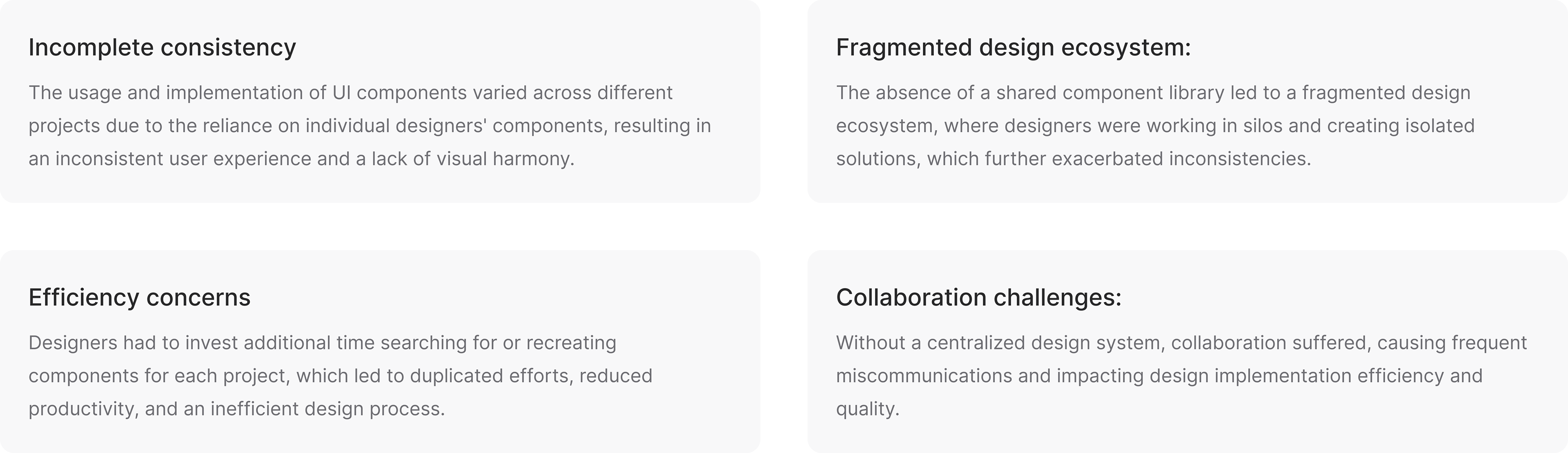
Key findings
Based on these observations and insights, it became evident that establishing a comprehensive design system within Figma was crucial to address these challenges, foster consistency, and improve collaboration across Zenyum's digital products.
The creation of Zenyum Design System
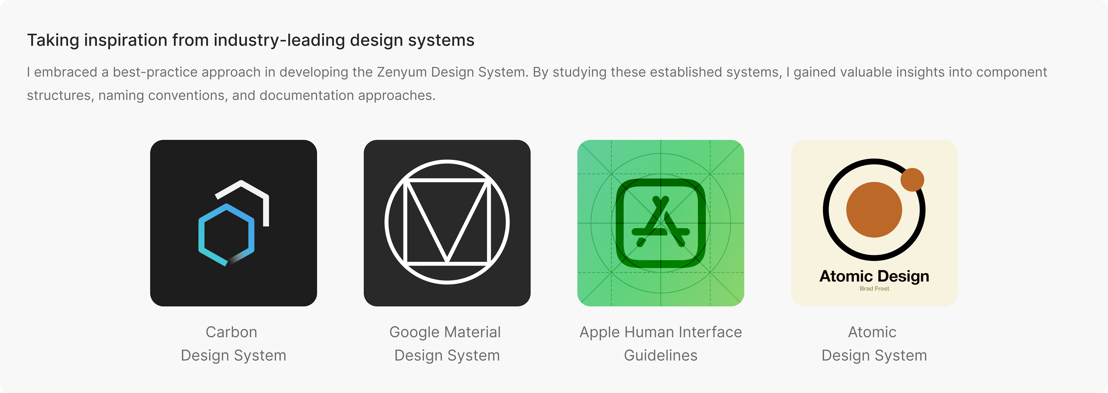
A Collaborative Adventure 🚀
The Zenyum Design System was created through a collaborative effort involving designers, developers, and product managers. The following key components were developed:
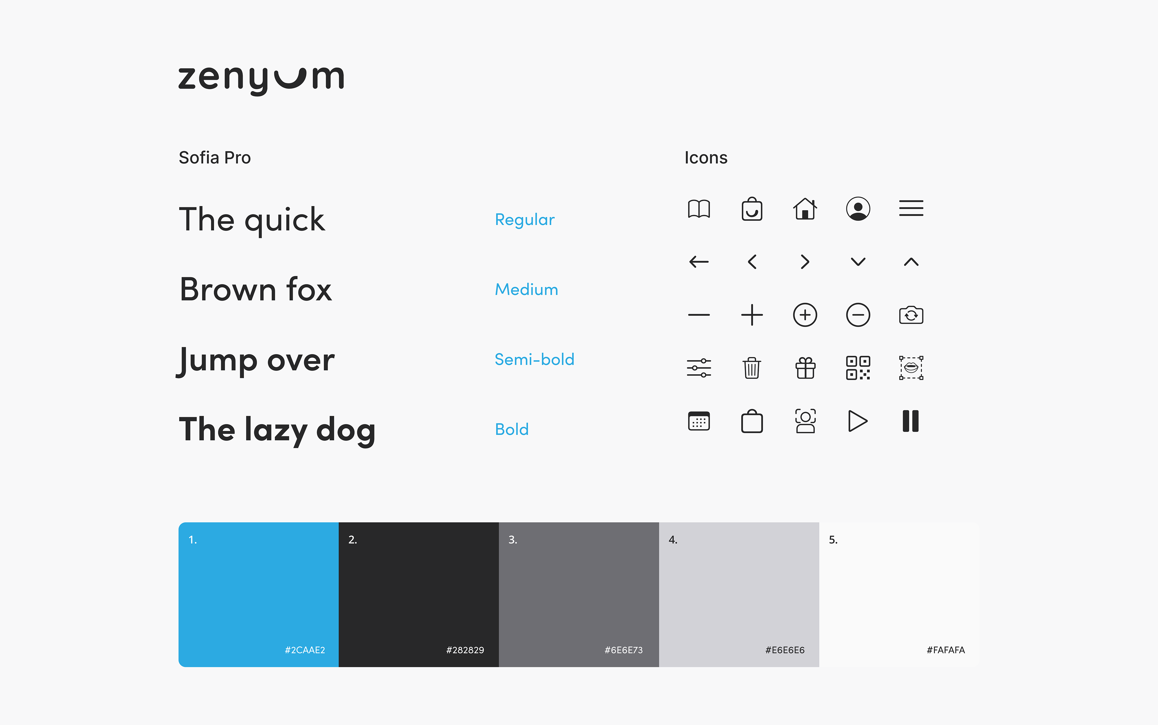
Setting up the visual style guide
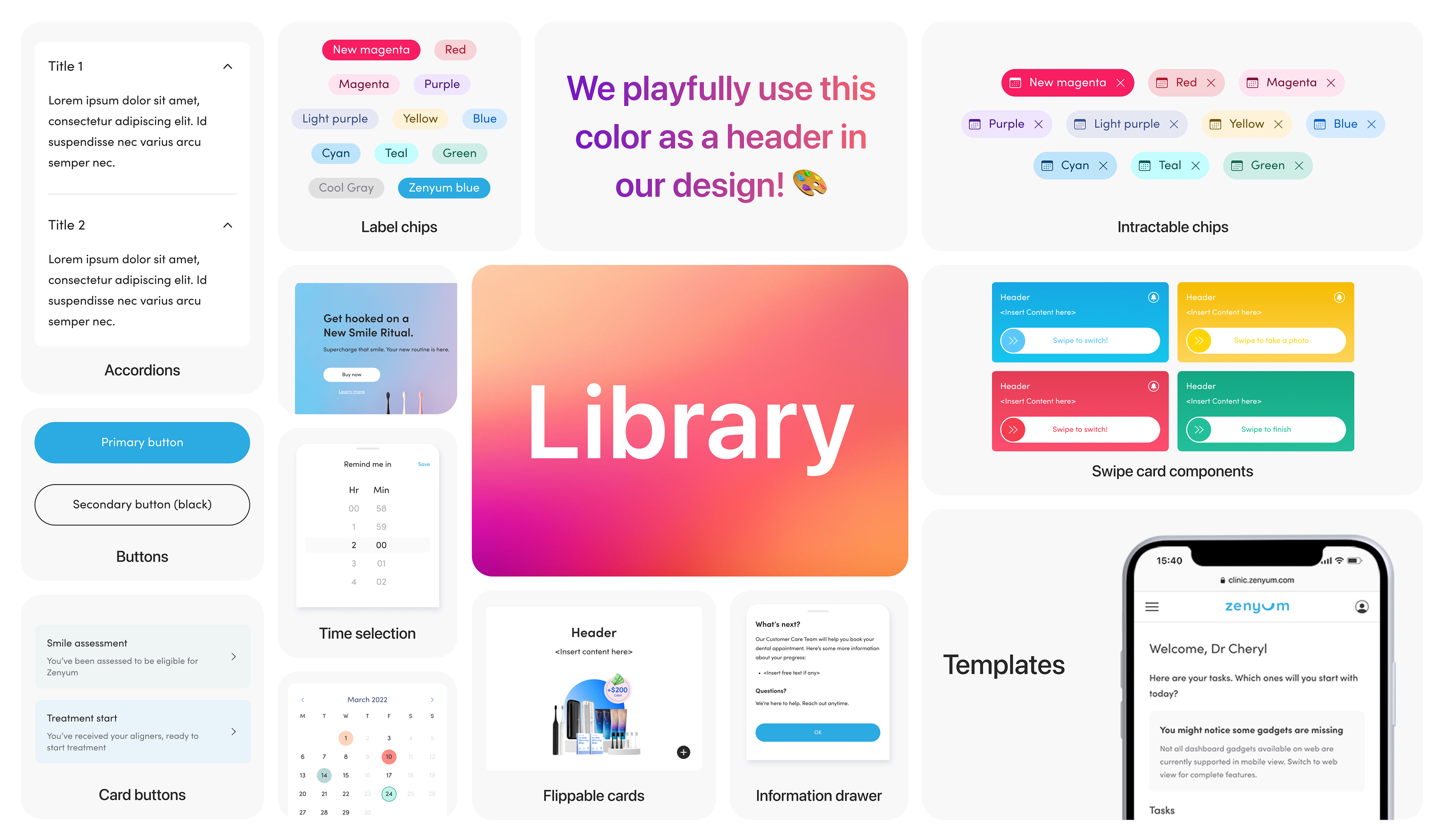
A visual guide was established, defining colour palettes, typography, iconography, and illustrations and imagery guidelines. This guides ensured a consistent visual language across Zenyum’s digital ecosystem, enhancing brand recognition and user experience.
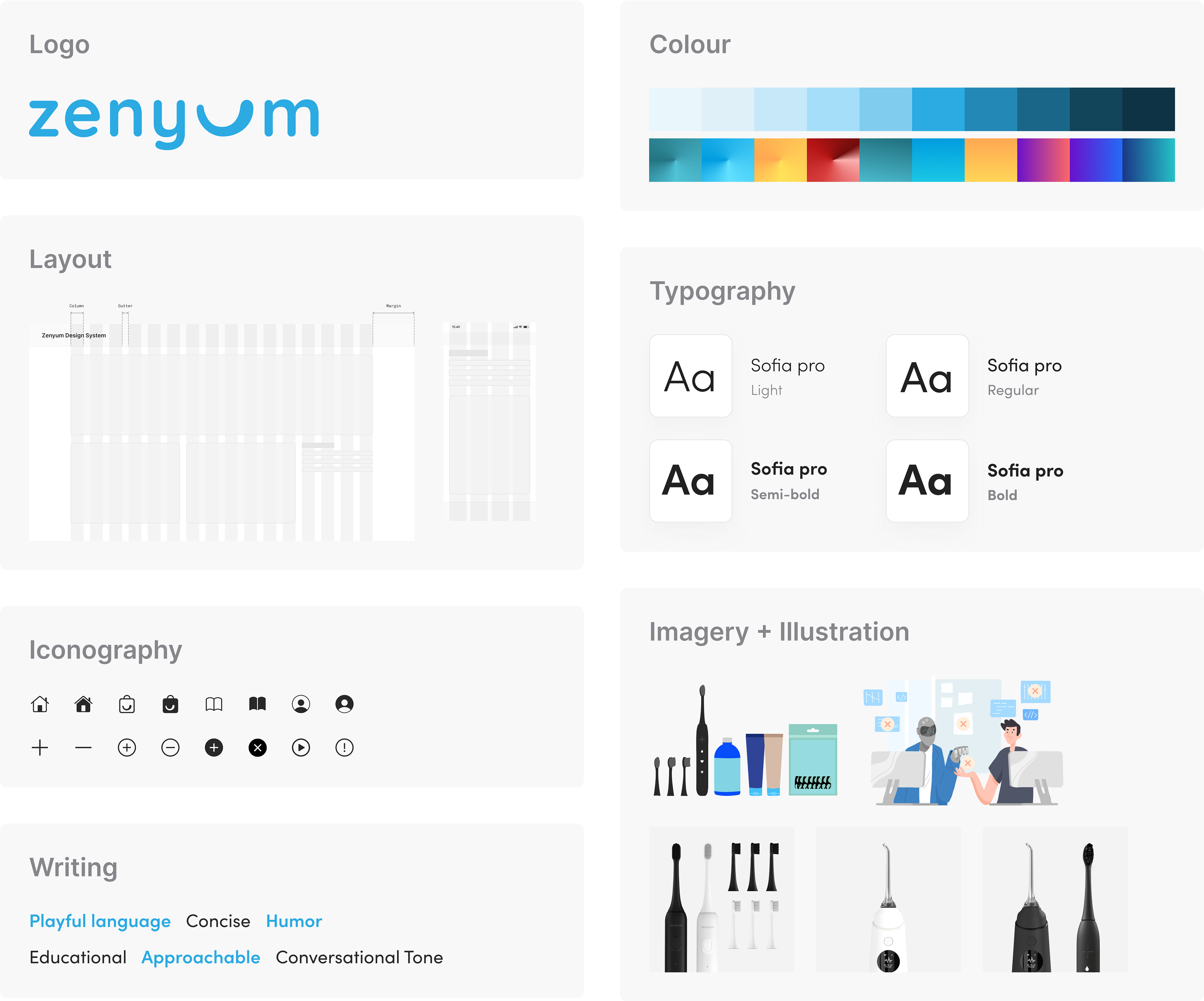
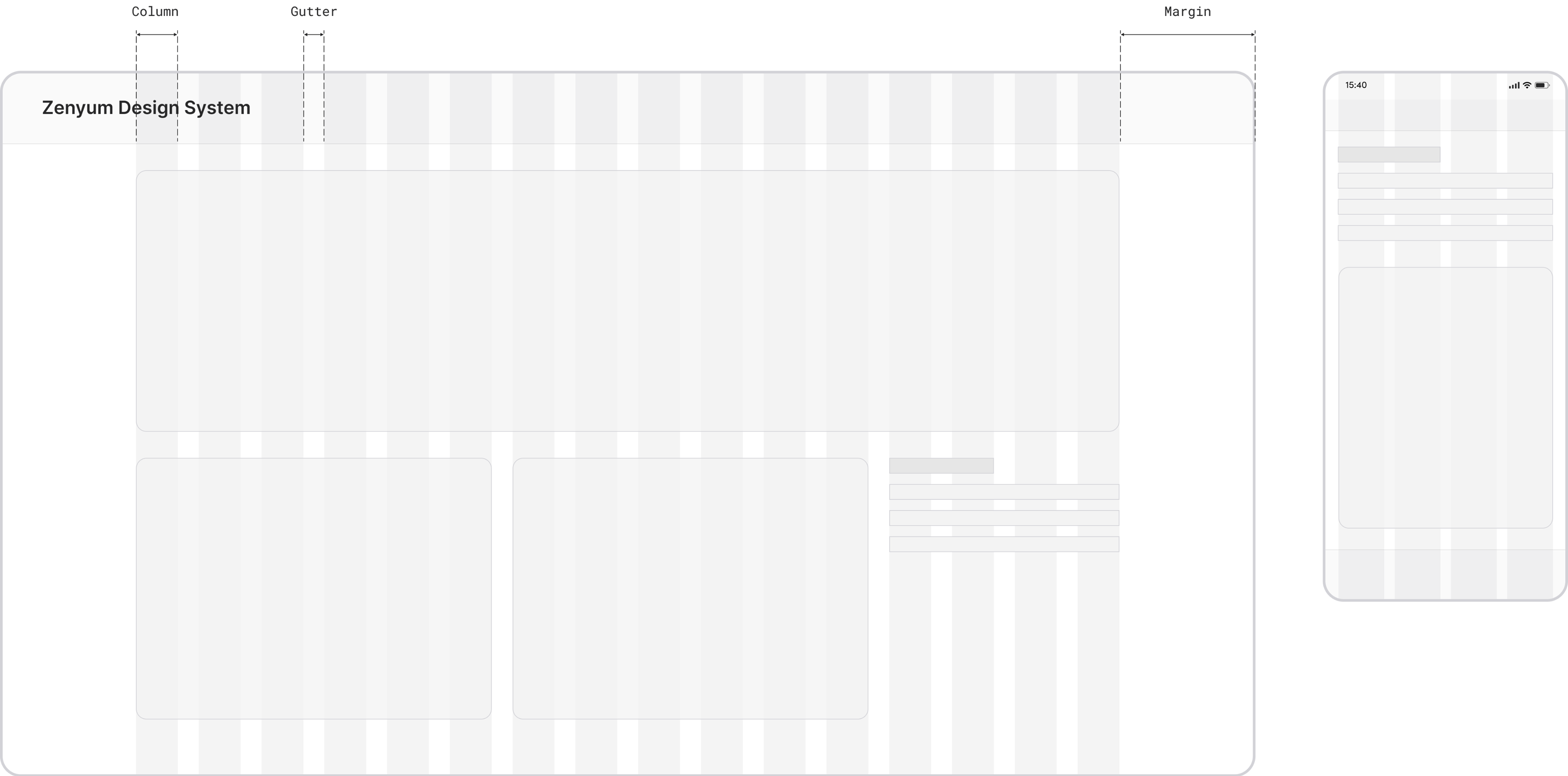
Responsive 16 columns grid
We've implemented a responsive 16-column grid, carefully considering different viewport environments, to ensure seamless usability in various settings. This streamlines content presentation and simplifies the creation of app and web services.
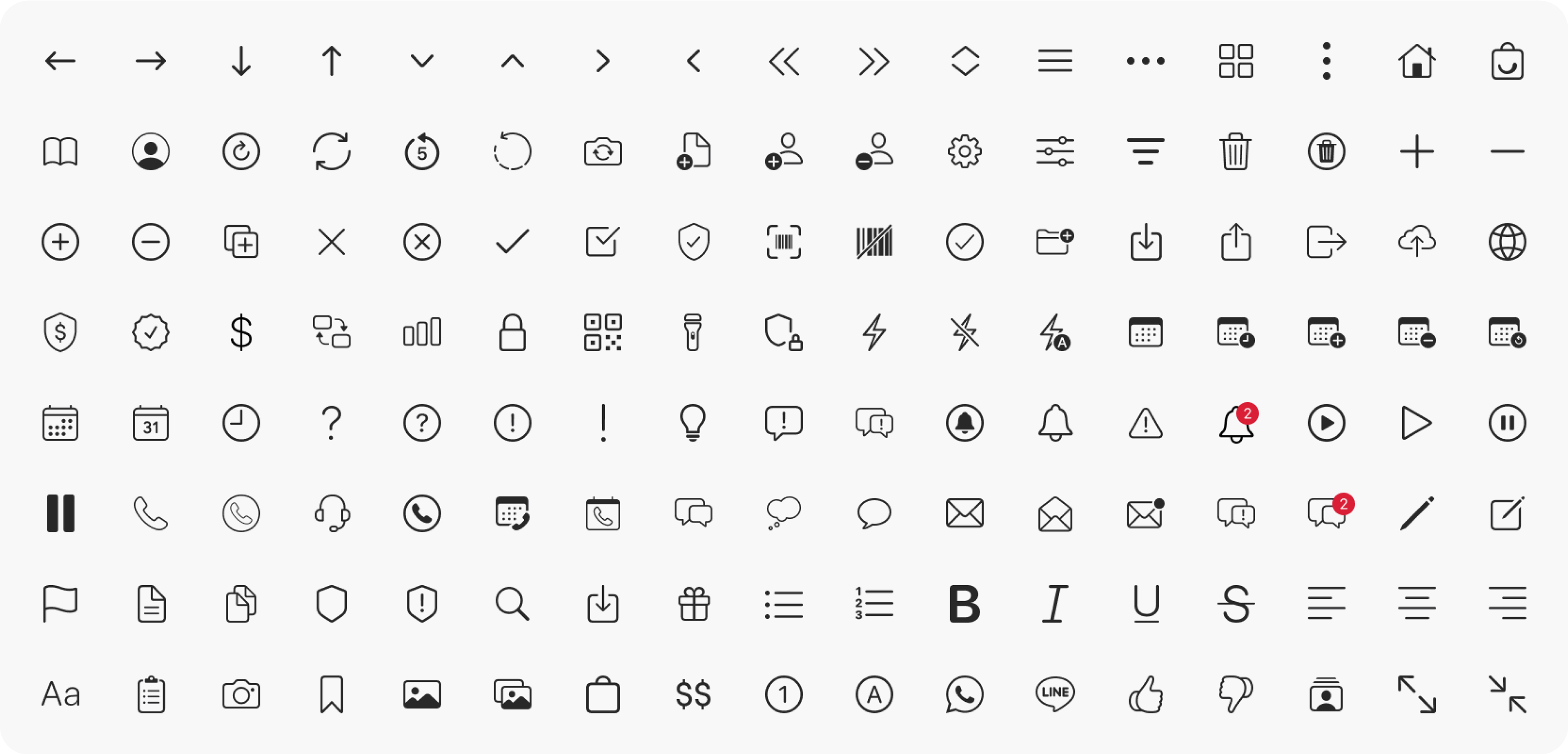
Iconography
In Zenyum's design system, thoughtfully designed and familiar icons serve as visual cues, guiding users to interact with the interface effortlessly. These recognisable icons enhance user experience and reinforce a seamless design language.

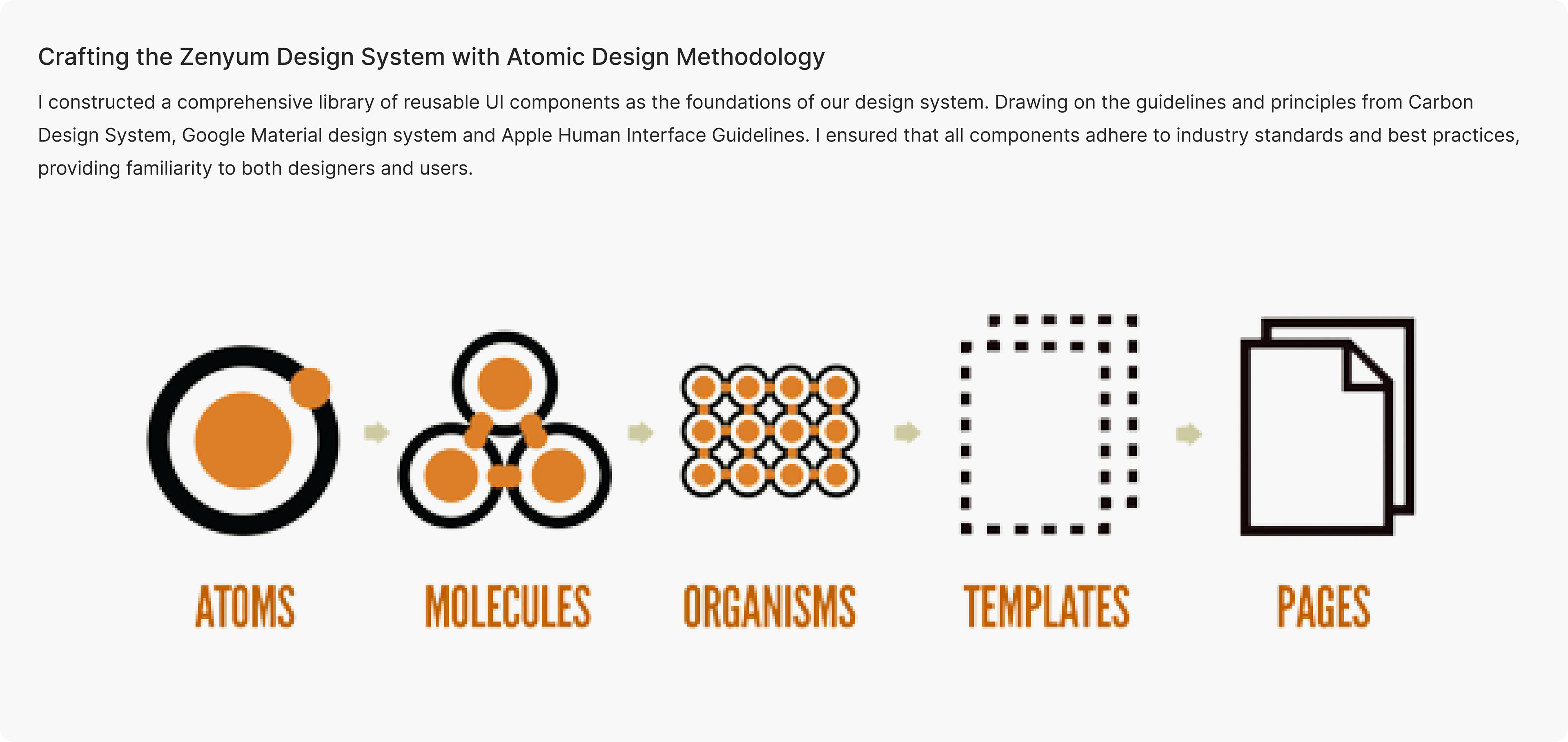
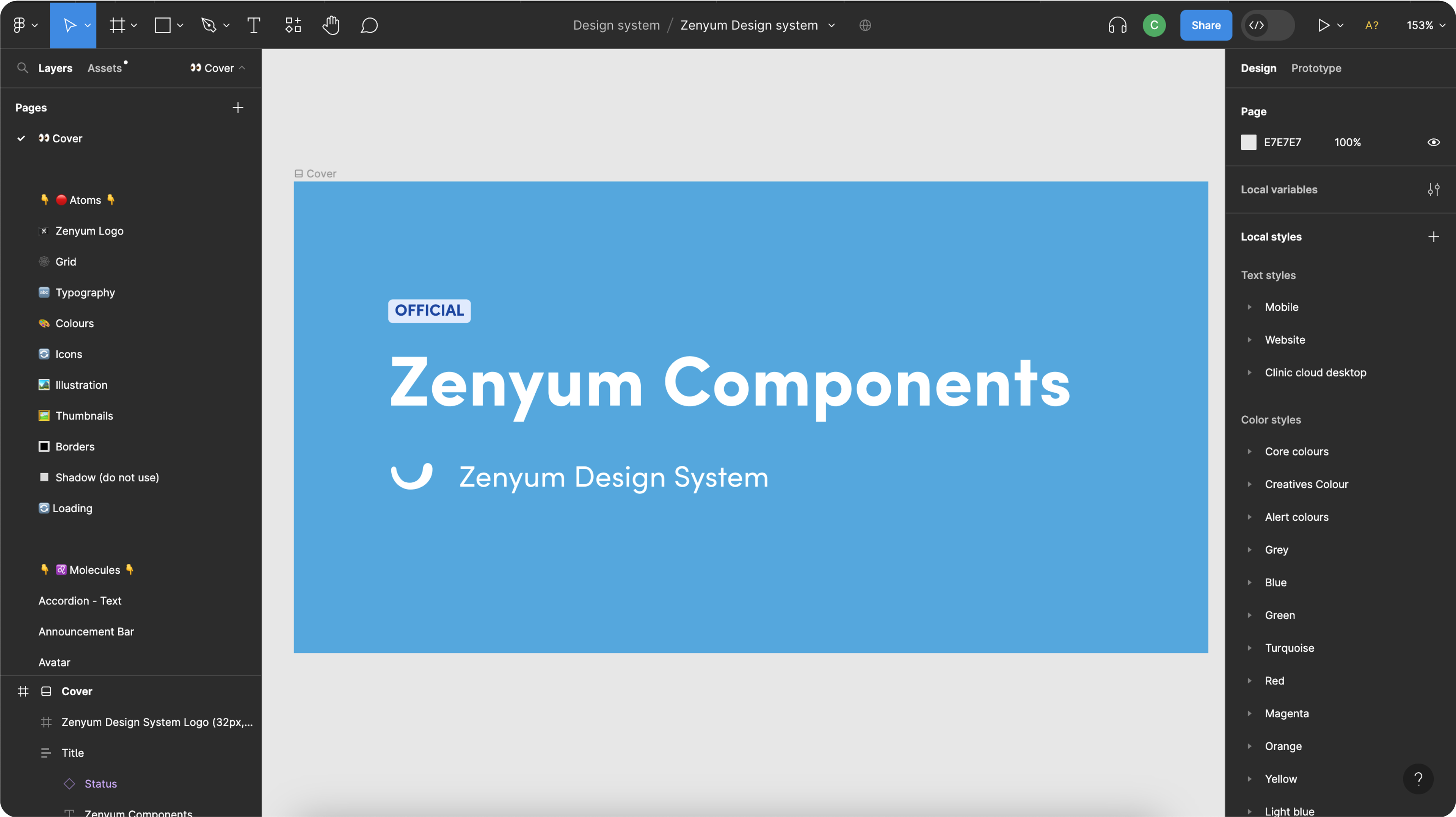
Component library
At Zenyum, we continuously explore innovative features and cutting-edge designs. To support their dynamic approach and ensure ongoing consistency, I diligently update the component library each month. This meticulously crafted library of reusable UI components adheres to usability and accessibility standards, offering pre-designed building blocks for diverse digital products, enhancing overall consistency and efficiency.
Documentations and guidelines
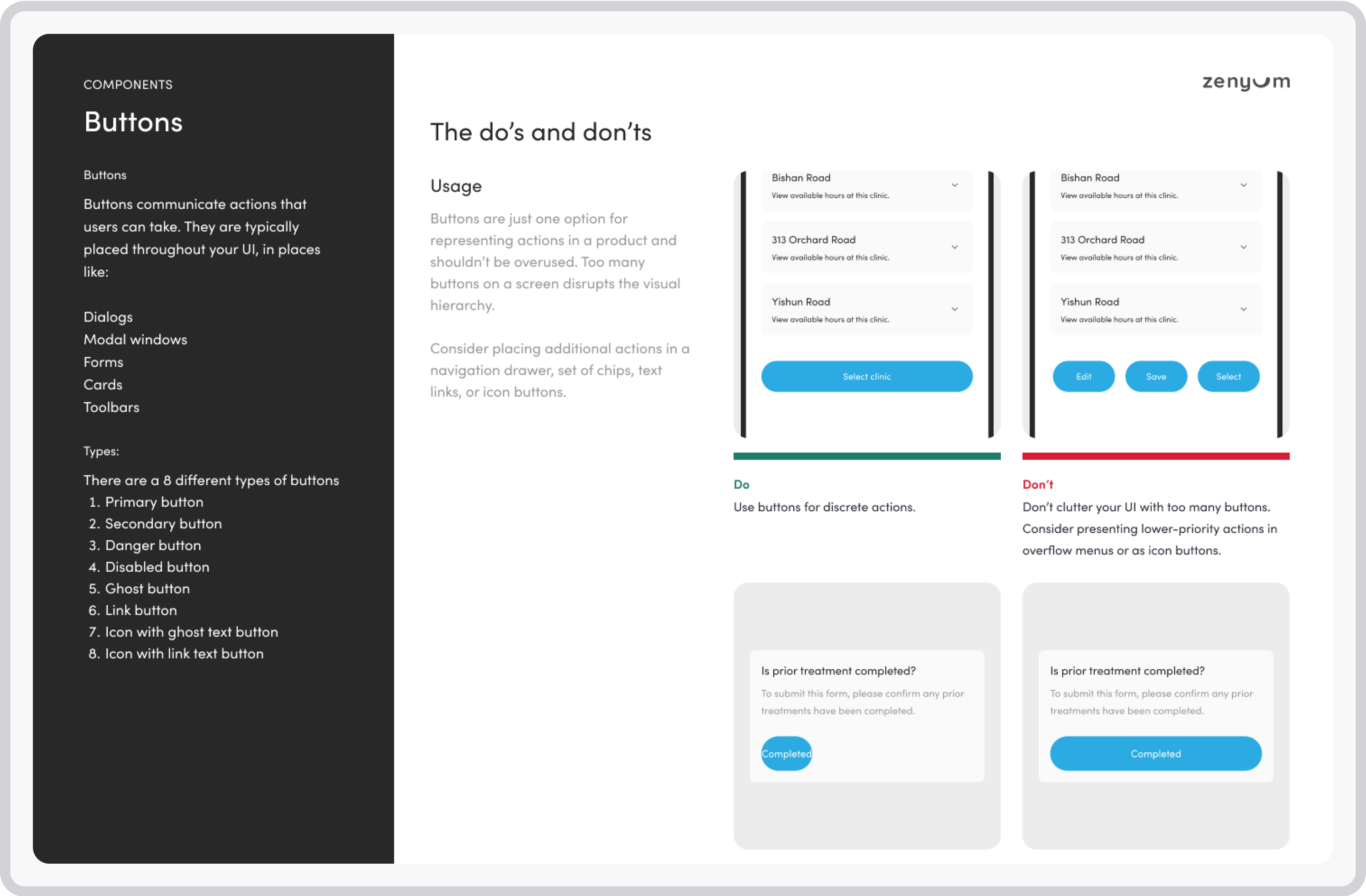
Using Figma as our documentation hub, we provide detailed guidelines for easy adoption of the design system. This comprehensive documentation empowers designers and developers, outlining each component's purpose, usage, and implementation. It includes clear do's and don'ts, ensuring adherence to design principles and a seamless user experience across Zenyum's products.
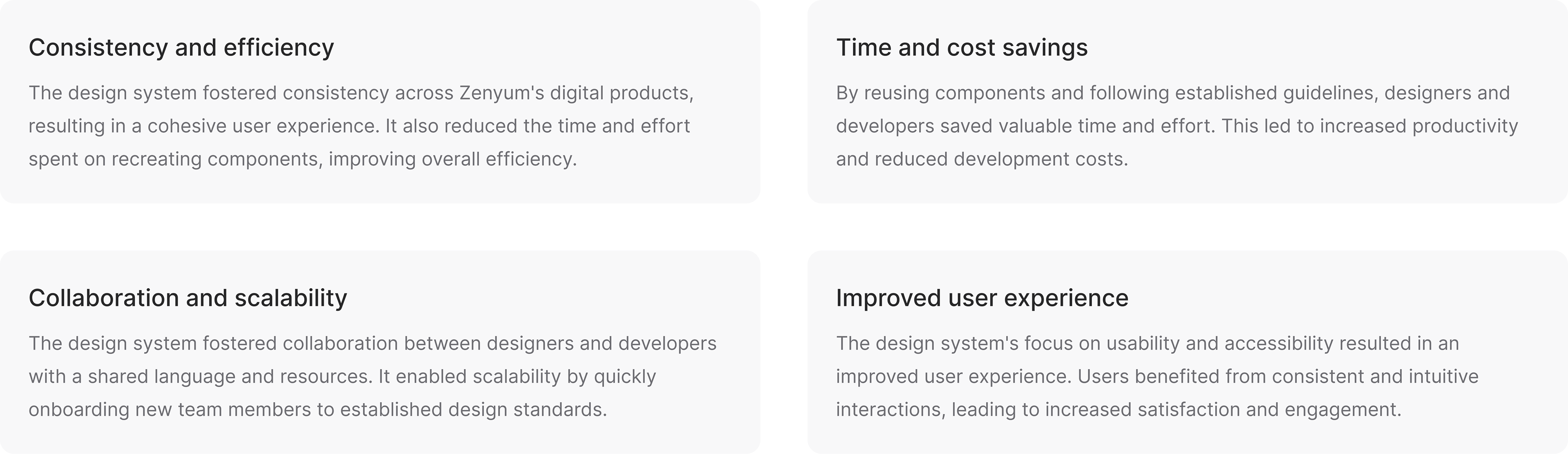
The outcome
The Zenyum Design System was successfully implemented, bringing about significant positive outcomes for the company: